GivingTuesday Series - What Is Your Call To Action?
Published: October 4, 2022
 by Janet Bargewell, GiveDirect Support
Convert a passive reader into an active supporter!
You send countless emails to your donor base. Most of these communicate news and updates, events, telling a donor's story, or sharing images and videos. It's likely the purpose of most of your communications is to inspire your audience to do something in support of your mission. This is your call to action. And through that call to action, you turn your reader into an active supporter.
How to Use a Call to Action
An effective Call to Action (CTA) does not have to ask for a donation. Yes, you will have those "Fundraising" CTAs, but you can also communicate "Informing" or "Involvement" CTAs.
| Fundraising | Inform / Educate | Involvement |
|---|---|---|
| Donate Now | Keep me informed | Sign the petition |
| Feed a child | Subscribe today | Leave a comment |
| Plant a tree | Read our blog | Become a member! |
| Protect (blank) from (blank) | Learn more | Volunteer today! |
| Make a difference in (year) | Call us | Call or visit your legislator |
| Yes! I'll help | Talk to us | Attend our event |
| Cure Cancer | Join our mailing list | Share this blog |
Tips for Creating an Effective Call to Action
Here are some simple tips to help you formulate your call to action.
- Convey Urgency: A feeling of urgency ("now" or "today") makes your audience feel waiting is not an option. "Save the polar bears before it's too late."
-
Make it Impactful: Strong action verbs such as "act, fight, end, and invest" makes your audience want to accept your call to action.
A CTA is no place to ask "please." "Donate to _______" is more powerful and impactful.
Avoid using passive voice: Instead of "start your subscription today" use "start my subscription today." A study by Campaign Monitor suggests this small change will increase clicks by 90%.
- Make it Concise: Make your CTA brief and clear. Does your CTA answer the question "What do you want me to do?" If more explanation is necessary, do it in your email or on your website. Your actual CTA should have very few words.
- Make it Consistent: Decide up front what you want from your reader. If your email asks for donations but your CTA asks for volunteers, this can be confusing and will be ineffective for both needs.
- Make it Creative: Don't get stuck in a rut. Find creative ways to ask your audience to engage. Make sure your CTA is easy to follow and understand. Imagine your CTA as an "I want to..." No one wants to submit a form, but they most definitely want to fight cancer or save the planet.
Evoke Emotion
Your Call To Action might take the form of a button that your reader can click. Or, it might be a link or text that is different from the rest of your content. It should be always be noticeable and stand out. Bright contrasting colors are great here.
Did you know certain colors evoke different emotions? Your CTA colors can assist in getting the emotional response you desire. Try these.
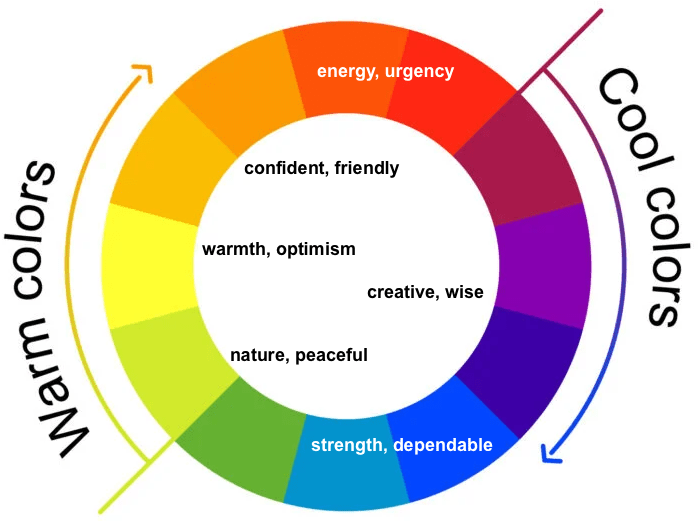
Below are some color and emotion combinations to try out on your Call To Action buttons.
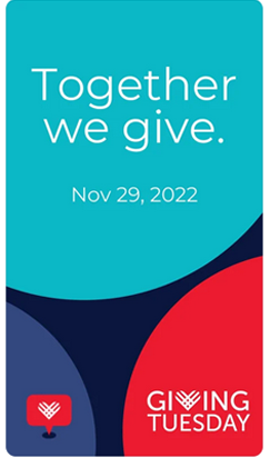
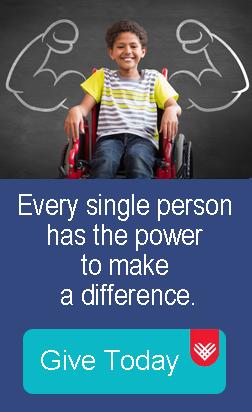
But first, let's discuss GivingTuesday buttons. GivingTuesday has adopted the colors of dark blue and aqua ("dependable" -- see color wheel above), and red ("urgency") as their brand colors. You will see these in some combination in all official "GivingTuesday" graphics.
like this one (theirs)...
or this one (ours).
For your convenience, here are the GivingTuesday colors along with their hex and RGB values.
Now for other campaign color and emotion combinations - try these out on your next Call To Action button.
emotion:

color: yellow
emotion:

color: green
emotion:

color: red or orange
emotion:

color: blue or purple
There are many color wheels and palette generators available online that you can use to make sure your colors "work" together. Canva is a great place to start if you don't already have a favorite.
Fundraising Progress Bar
One way to create a sense of urgency around your Call To Action is by using a fundraising progress bar on your GiveDirect donation form. Especially for a short term appeal like GivingTuesday, assigning a goal amount to your campaign and encouraging your supporters to help you meet your goal in time can create a sense of collective urgent action.
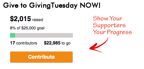
It's easy to set up a fundraising progress bar on your GiveDirect donation form.
Using Color on Your GivingTuesday Fundraising Form
OK, last but not last least! Let's talk about using colors when building your GiveDirect GivingTuesday Fundraising Form.
Colors can be applied to your donation page first and foremost in the Header Image area.
You should consider using a pre-designed GivingTuesday graphic that you can download from Canva. Or, make your own that suits your campaign theme (similar to our example graphic above).
You can also apply color to your form in the Amount section, the Form Basics section, and the Submit Button section. If it fits with your overall branding, consider using GivingTuesday colors in these areas for your GivingTuesday donation appeal form.